Q3: What have you learnt from your audience feedback?
I used survey monkey to gain audience feedback by creating questions and giving the survey to people as they view the video, this helped me to gather information and constructive feedback for our real media product as well as ancillary texts. I also asked a focus group some questions about our music video, website and digipak.
Our music video was aimed at 16-22 year olds due to the use of explicit language in our chosen song. We decided that we would target the male audience before the female as typically the rap genre is enjoyed more by a larger male audience.
I have created some profiles of our target audience which are mostly primary but also contain some secondary and tertiary audience that we aim to reach.
Music Video First Draft Feedback:
We showed our first draft music video to peers in order to receive a variety of feedback so that we were able to see whether the general concept and conventions of the video worked. We got a range of feedback from both male and female, predominantly in the age range of 16-18. Below is the most constructive feedback we received from our audience when we showed them the first draft of our music video.

Digipak First Draft:
We also showed our first draft digipak to peers in order to gain some feedback as to how we could improve but also what aspects they liked. The marks out of 10 that we were given are below:
level 3 - 8 marks
level 3 - 8 marks
level 2 - 6 marks
level 3 - 8 marks
level 3- 7 marks
level 2 - 4 marks
level 2 - 5 marks
level 2 - 6 marks
Positives
(WORDLE)
Negatives
(WORDLE)
To act on the feedback that we received we decided to make some changes to our digipak to improve it.
We added a lyric sheet but tried to make sure it wasn't too text heavy as this would be distracting and boring to look at. We added an image of iSO and blacked it out to match our galaxy theme. We also reduced the lyrics on the sheet so it wasn't overwhelming to read. This will replace one of the DNA strands.

We moved the special thanks up one square on the grid so it is on the back of the digipak as we felt this was an appropriate layout.

Website First Draft:
We received some constructive feedback on our website as to what we can do to improve it and what people thought worked well with it. There was a mixed opinion as to the over outcome of what everyone thought of our website. Our scores were:

5
7
9
8
7
In order to improve our website we have taken these comments into consideration and have tried to improve the website in general but also in specific places that were mentioned as feedback.
 Firstly, we changed the store icon from red to white as it fits in a lot better with the black and white background, being a continuous theme throughout the digipak and website. This was only a small detail that our group didn't think about but was largely recognised by our peers.
 We then changed the layour of the about page completely and added a link to instagram, a description of iSO and the record label as people were confused as to iSO and the Real Proviso Records, which is iSO's record label. We added some other content to this page as people said it was too basic and short so they didn't have enough of an understanding as to who iSO was and his background.

James added the link to iSO's twitter page and instagram page and put them in a visible place of each page on the website to maintain consistency. This also makes it easily accessible for anyone navigating around the website by being able to view his social media at any time.
Online Survey:
I created a survey online so that I could address a larger audience and gather wide range of opinions.


These were the results we gathered from the online survey. We were able to see that we had a balance between male and female and our primary age group answering this survey was 17-21 year olds.


Questionnaire for audience feedback on music video:
Below is 4 male and female members that have watched my music video and then given me a response face to face. I asked a variety of questions as to what they liked and what they thought we could improve on. It gave us vital feedback as they gave honest answers which helped us to relate back to our target audience deciding if we targeted everything correctly.
INSERT VIDEO
Survey for Digipak and Website:
I created a short survey which enabled me to get some concise feedback as to what scores people thought our digipak and website would achieve. It enabled me to see what they thought about the layout, content, text, images and merchandise.
Our music video was aimed at 16-22 year olds due to the use of explicit language in our chosen song. We decided that we would target the male audience before the female as typically the rap genre is enjoyed more by a larger male audience.
I have created some profiles of our target audience which are mostly primary but also contain some secondary and tertiary audience that we aim to reach.
Music Video First Draft Feedback:
We showed our first draft music video to peers in order to receive a variety of feedback so that we were able to see whether the general concept and conventions of the video worked. We got a range of feedback from both male and female, predominantly in the age range of 16-18. Below is the most constructive feedback we received from our audience when we showed them the first draft of our music video.

Digipak First Draft:
We also showed our first draft digipak to peers in order to gain some feedback as to how we could improve but also what aspects they liked. The marks out of 10 that we were given are below:
level 3 - 8 marks
level 3 - 8 marks
level 2 - 6 marks
level 3 - 8 marks
level 3- 7 marks
level 2 - 4 marks
level 2 - 5 marks
level 2 - 6 marks
Positives
(WORDLE)
Negatives
(WORDLE)
To act on the feedback that we received we decided to make some changes to our digipak to improve it.
We added a lyric sheet but tried to make sure it wasn't too text heavy as this would be distracting and boring to look at. We added an image of iSO and blacked it out to match our galaxy theme. We also reduced the lyrics on the sheet so it wasn't overwhelming to read. This will replace one of the DNA strands.

We moved the special thanks up one square on the grid so it is on the back of the digipak as we felt this was an appropriate layout.

Website First Draft:
We received some constructive feedback on our website as to what we can do to improve it and what people thought worked well with it. There was a mixed opinion as to the over outcome of what everyone thought of our website. Our scores were:

5
7
9
8
7
In order to improve our website we have taken these comments into consideration and have tried to improve the website in general but also in specific places that were mentioned as feedback.
Firstly, we changed the store icon from red to white as it fits in a lot better with the black and white background, being a continuous theme throughout the digipak and website. This was only a small detail that our group didn't think about but was largely recognised by our peers.  We then changed the layour of the about page completely and added a link to instagram, a description of iSO and the record label as people were confused as to iSO and the Real Proviso Records, which is iSO's record label. We added some other content to this page as people said it was too basic and short so they didn't have enough of an understanding as to who iSO was and his background.
James added the link to iSO's twitter page and instagram page and put them in a visible place of each page on the website to maintain consistency. This also makes it easily accessible for anyone navigating around the website by being able to view his social media at any time.
Online Survey:
I created a survey online so that I could address a larger audience and gather wide range of opinions.


These were the results we gathered from the online survey. We were able to see that we had a balance between male and female and our primary age group answering this survey was 17-21 year olds.


Questionnaire for audience feedback on music video:
Below is 4 male and female members that have watched my music video and then given me a response face to face. I asked a variety of questions as to what they liked and what they thought we could improve on. It gave us vital feedback as they gave honest answers which helped us to relate back to our target audience deciding if we targeted everything correctly.
INSERT VIDEO
Survey for Digipak and Website:
I created a short survey which enabled me to get some concise feedback as to what scores people thought our digipak and website would achieve. It enabled me to see what they thought about the layout, content, text, images and merchandise.
Q2: How effective is the combination of your main product and ancillary texts?
 fter completing our final music video we wanted to make sure that our digipak and website were completed to the same standard and to the best of our ability in order to achieve full marks. Our main product and ancillary texts were created to be as synergistic as possible in this cross-platform marketing campaign, attempting to create a strong brand identity. We aimed to create suitable advertisement for our artist to accompany our product and ancillary texts so that we could create and gain active social media presence and followers. In order to achieve this we recorded an interview with our up and coming artist, created a magazine article and used social media for general promotion.
 Throughout this process, we wanted to promote the uniqueness of our newest artist and share his new found talent amongst other who'll listen. I feel that this was displayed effectively through our digipak, website and music video using consistency as their is a continual theme and colour scheme throughout. We created the digipak and website with the music video in mind so that we could make them link and as a whole promote our new artist. This way, all our texts are linked effectively. Each product is also designed to promote the different products in the range whilst maintaining synergy.
Within the music video, there are links between our general theme and concept that we tried to portray through the music video and ancillary texts. Our primary target audience is 15-22 year olds but more specifically, those who are interested in rap music. Our target audience is relative to our social media audience feedback found on our iSO page.
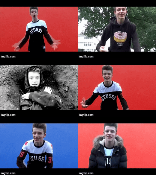
At the beginning of the music video there are several shots of the sun moving across the sky as time lapses. This relates to the galaxy theme applied throughout our website and digipak.
The continual scheme of dark colours and darker backgrounds used for the digipak, website and album cover are contrasted as these brighter colours feature in the middle of the music video. However the colours also appear on the album cover and the digipak in the ora around iSO.
The continual scheme of dark colours and darker backgrounds used for the digipak, website and album cover are contrasted as these brighter colours feature in the middle of the music video. However the colours also appear on the album cover and the digipak in the ora around iSO.

There's a glow around some of the shots which makes it look like the glow of outer space also linking in with the galaxy theme. This is referenced to on the album cover too as it has an 'ora like' glow around the image of iSO.
Q1: In what ways does your media product use, develop or challenge forms and conventions of real media products?
Before creating our music video we conducted research into rap artists and their brand identities. From this we then established a list of conventions of the Hip Hop genre that we could either develop or challenge. We found genre conventions from analysing products in our genre like Logic's Under Pressure and looking at how other white rappers like G-Eazy's image is presented. I think that we subverted many of the traditional Hip Hop genre characteristics but conformed to some of the lesser known genre characteristics.
Style of our music video:
After hearing Buried Alive by Logic, our chosen song, it was obvious that we could use the title to base the music video on. As well as matching the title of the song, basing our music video on being buried alive fits in with the Hip-Hop genre as darkness and death are often themes in Hip Hop songs.
As you can see from the visual mood board I made we drew inspiration from moguls of Hip Hop such as Eminem and Kendrick Lamar but also smaller artists like Logic.
Narrative of our music video:
Typically Hip-Hop music videos do not contain a lot of narrative and are usually based on performance. However similar artists to ours like Logic and G-Eazy music videos both consist of performance and narrative hybrids. So we decided after research to make our music video a hybrid of performance and narrative.
G-Eazy's music video for single 'I Mean It' sees him in the role of a news presenter, which forms the basis of the narrative. As he plays the news reader and himself, as the interview is ongoing he begins to rap parts of the song which form the performance side of the music video.
Logic's music video for his latest single 'Young Jesus' is also a hybrid of performance and narrative. As he plays many different characters like a chef, shown below, and later on a police officer and news witness. But in between all of these roles he lip syncs parts of the song.
After doing research and seeing similar artists like Logic and G-Eazy music videos it became obvious that the vast majority of them were hybrids. So we decided to conform to current Hip Hop genre conventions and make our music video a hybrid of performance and narrative.
Consumption Habits:
One of the purposes of a music video is to be entertaining and be interesting enough to watch repetitively. As our music video is a hybrid of narrative and performance we couldn't keep our audience entertained with just narrative. So after doing our research on UK Hip Hop artists we identified that to make their music videos as interesting as possible they use a large variety of locations in comparison to other genres such as Pop and Rock. Below is an example of a UK Hip Hop artist, Nines, using lots of different locations to keep the viewers interest on a performance based music video.
The music video contains in total fifteen different locations. In comparison our music only has seven different locations but we used lots of cuts to keep the video interesting similar to Nines music video however the song is slower and therefore there are less cuts in Nines video than in ours.
Album cover:
The main functions of an album cover are:
Above are some debut album covers from white UK and American Hip Hop artists. Although as you can see the album art varies from artist there some characteristics which are identical. For example the album name is always in bigger font than the artist name, in this respect we conformed to our genre as we have done the same with our album cover.
As you can see we took inspiration from our visual moodboard when creating our album cover. Below is an annotated version of our digipack cover. Which shows in what ways we conformed and challenged Hip Hop genres.
 Website:
Our website in our marketing campaign for iSO plays a vital role, as it's purpose was not only to promote the artist but also the record label and the products. The presentation below explains in what ways our website conforms to and challenges the Hip Hop genre.
Style of our music video:
After hearing Buried Alive by Logic, our chosen song, it was obvious that we could use the title to base the music video on. As well as matching the title of the song, basing our music video on being buried alive fits in with the Hip-Hop genre as darkness and death are often themes in Hip Hop songs.
 |
| Our visual moodboard |
Narrative of our music video:
Typically Hip-Hop music videos do not contain a lot of narrative and are usually based on performance. However similar artists to ours like Logic and G-Eazy music videos both consist of performance and narrative hybrids. So we decided after research to make our music video a hybrid of performance and narrative.
 |
| G-Eazy combing narrative and performance |
 |
| Example of Logic combining narrative and performance |
 |
| Balance between narrative and performance |
Consumption Habits:
One of the purposes of a music video is to be entertaining and be interesting enough to watch repetitively. As our music video is a hybrid of narrative and performance we couldn't keep our audience entertained with just narrative. So after doing our research on UK Hip Hop artists we identified that to make their music videos as interesting as possible they use a large variety of locations in comparison to other genres such as Pop and Rock. Below is an example of a UK Hip Hop artist, Nines, using lots of different locations to keep the viewers interest on a performance based music video.
The music video contains in total fifteen different locations. In comparison our music only has seven different locations but we used lots of cuts to keep the video interesting similar to Nines music video however the song is slower and therefore there are less cuts in Nines video than in ours.
Music video for Nines (UK Hip-Hop artist) 'Can't Blame Me'
Album cover:
The main functions of an album cover are:
- Providing information about the music and the production of it
- Giving the audience a suggestion of what the music is like and what genre it is
- Acting as visual advertising, usually being the primary form of advertising aside form social media and tour dates poster
- Having sentimental value to fans and the audience
Above are some debut album covers from white UK and American Hip Hop artists. Although as you can see the album art varies from artist there some characteristics which are identical. For example the album name is always in bigger font than the artist name, in this respect we conformed to our genre as we have done the same with our album cover.
 |
| Our album cover |

Our website in our marketing campaign for iSO plays a vital role, as it's purpose was not only to promote the artist but also the record label and the products. The presentation below explains in what ways our website conforms to and challenges the Hip Hop genre.
iSO as an artist largely challenged genre characteristics, as a new artist it is important to challenge conventions especially as iSO is somewhat of a niche artist, A UK white rapper.
Colour Change Effect
One of the effects which I implemented into my music video was the colour-change effect. Here is how I carried out the process:

 |
| Me and Issak found this container which was clean and had a perfect background for the colour change effect |
 |
| An example of the finished result |
Reverse Speed Effect
In my music video there is a relatively simple effect created through using reverse speed.

To achieve this effect, I firstly placed the clip in the desired place on the timeline. Then, I right-clicked the footage. I then selected the option reading 'Speed/Duration', a 'Clip Speed / Duration' box then appears. I altered the clip speed to 200% (2x) the normal speed for two reasons:
To ensure the reversal of speed is seamless.
To make sure that the clip is in time to the beat of the song.
I then checked the 'Reverse Speed' box. Job done.

Final Digipack
 |
| Our final Digipack |
J Cole - She Knows Analysis
J Cole - She Knows
"She Knows" is a single by American Hip-Hop artist J Cole taken from his album Born Sinner, released in 2013.
- Music videos demonstrate genre characteristics ( Hip-Hop)
 |
- There is a relationship between the lyrics and the visuals
The relationship between the lyrics and visuals are subtle because the video is narrative but there are many links. For example the shot below is in time with the lyrics "Got me up so high". Also Kyle and his friend are seen running away from the cops in time with the lyrics "Can't be what you wan't from me" which could be referring to how Kyle is letting down his parents by skipping school. Both of these examples amplify the lyrics rather than contrast them.

- There are normally close-ups of the artist to promote them

Final Website
Our completed website has five pages: Home, About, News, Store and Contact. All of the pages can be seen above. I tried to maintain the same image we have for the Digipack and music video and to make the website similar to Hip-Hop artists like Logic and G-Eazy.
Digipack 1st Draft
 |
| Digipack 1st Draft |
 |
| Example of our Digipack in use |
 |
| Example of the back cover in use |
Merchandise for Store
After researching other artists websites and specifically stores it became obvious that stores are a big part of artists like Logic and G-Eazy's websites. So I decided to dedicate a lot of time to making professional products and adding discounts.
As part of my research I identified that Black was very common in our genre but also in similar artists products. So many of the products, especially the clothing are Black. Offerings on G-Eazy's website were mainly types of clothing so I decided that our store should also largely feature clothing. However I have also included accessories such as phone cases and rucksacks.
In the preview section of the store I included at least one image of the chosen product, a description of the item and a SKU code. There are also links to social media as this was something that people suggested in the feedback for the website.
As iSO is an up and coming artist I decided that our products should be priced very competitively. So I made the products all slightly above real cost and added a 10% discount code - "iso10". This was also something I identified from my website research as Logic is known for making his merchandise very cheap in order to give back to his fans.
 |
| Full store screenshot |
 |
| Example of product preview for iSO stickers |
 |
| Example of 10% discount |
Digipack Improvements

To improve our Digipack we will:
- Add a lyric sheet to replace one of the DNA strands
- Move the special thanks up one one the grid so it is on the back
Shooting Schedule #3
 |
Above is our shooting schedule that Libby created for our group to understand what our plan was in terms of shots we still wanted and at which locations. |
Acting On Website Feedback
After receiving feedback on my website I picked out some of the best comments and made changes based on the suggestions.
1. "The store icon doesn't fit in with the theme because of the colour."
I changed the store icon from Red to White as it fits in a lot better with the black and white background.
2. "The about page is too basic and doesn't have enough content."
I changed the layout of the about page completely and added a link to Instagram, a description of iSO and the record label as people were getting confused by the Real Proviso name.
3. "Social media links should be used more as that is a main form of promotion"
1. "The store icon doesn't fit in with the theme because of the colour."
I changed the store icon from Red to White as it fits in a lot better with the black and white background.
 |
| New store icon |
I changed the layout of the about page completely and added a link to Instagram, a description of iSO and the record label as people were getting confused by the Real Proviso name.
 |
| Updated about page |
I added Twitter and Instagram links to every page and put them in the corner of each page to amintain consistency.
 |
| Example of Twitter link |
Website Feedback
Today we received feedback from other media students on our website. Most of the feedback was very good with my website scoring on average 7/8 out of 10 from. However there was a lot of good comments on how I can improve the website, some of the best comments can be seen below:
iSO:
On this website I really like how the background links with
the album with the galaxy and colour scheme. the links at the top of the page
look good and professional like the logo. the bag looks a little out of place
and being red makes it sand out a lot which kinda emphasizes this. The pages
themselves look good shows the artists themes and how he is represented well.
merchandise looks really professional. the contact page looks really good with
the pin on the record company. add the social networking sites to the bottom of
each page so that it is consistent and easily accessible to the audience. On
the store page make the phone case image larger so that it is easier to see.
iSO:
There is a visible theme (monochrome) and your genre is
apparent. There are working links. There isn’t much text. Even though you have
your new album cover on your homepage I feel like the background should be of
the artist. There is only one photo of the artist which is used throughout the
website.
The real Proviso(iso) - 8 Good layout on the front page and
its good that it points straight to the new album. The quality of the iso could
be improved. The about page is good and i like the way it goes straight to
instagram. News page is the best page and its very good detail. I like the
discount on the store. The map on the contact page is good. Could the
background move at all?
iSO:
The website created by ISO is nearing completion and because
of this the website looks professional the only comment I would make would be
on the amount of information that is provided. Information that could be shown
could be more about the creation of the song and more detail about the artist
rather than a few sentences that give a slight idea but it is still unclear.
The background of the website is very effective with creating the image of ISO
because the black and white look is replicated within all products which have
realistic prices. The use of the map to show the location of the Real Proviso
is clever and makes it look professional.
ISO - The home page for ISO is very simple but effective. i
like the dark background as it settles in with the image for his music video as
well and the genre he is following. The about page is very poor as i feel it is
organised badly therefore it looks basic and low budget. ISO could add more
information on this page and set the pictures out differently to make it more
effective and better to look at. The merchandise looks good and fits in with the
dark colours from the website.
 |
| Website scores |
Filming in Town and at Crematorium
As we were behind due to our lack of footage me and Issak decided to dedicate a whole day to filming. We went to the crematorium to get more shots as some of the stuff we filmed there before was very good. We also filmed in urban parts of town and at the Graffiti Wall.
As we spent all day filming we got the majority of footage for our music video. Especially the parts at the end that we were missing and we can now replace some of the poorer shots from our first time filming.
As we spent all day filming we got the majority of footage for our music video. Especially the parts at the end that we were missing and we can now replace some of the poorer shots from our first time filming.
 |
| Panorama Issak took whilst standing on Graffiti wall |
Subscribe to:
Posts (Atom)